Button
Documentation - components
COMPOSER ITEM
LIVE PREVIEW AND HTML DOCUMENTATION
PREVIEW
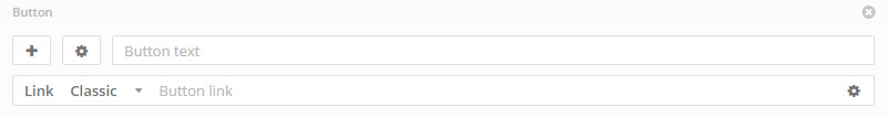
ADMIN PREVIEW
USAGE
This component is a button that allow you to open almost everything.
Classic link
Link to external website or page (ex. http://www.google.com)
Lightbox link
Open the content into a lightbox. You can open the contents below.
Custom link
Custom link allow to insert all the contents you want. These contents will be showed into a lightbox.
Lightbox content types
Image - http://www.yoursite.com/image.jpg
Youtube , Vimeo, MP4 video - https://www.youtube.com/watch?v=zyV22q8PfBA
Google Map - https://maps.google.com/maps?q=New+York,+United+States
Custom content ID - #yourid
Images and MP4 videos
You can upload it with the right button:
Google Map
Use link https://maps.google.com/maps?q= and append your address, replace spaces with +.
Custom content ID
You can create a separated content (column) in the same page and open it as lightbox. To do this create your content by add a new column where you want and click on CSS icon , on custom classes add class
box-lightbox and on top right copy the ID, paste it into the button link field with # before the id (ex. #column_5ZtkF)OPTIONS
- Icon The button icon
- Style Style of button. Live preview on HTML documentation
- Position Position of the button, Full position set the button's width to 100%, same of container width
- Animated Animation on mouse hover
- Lightbox animation Animation effect. Supported only for lightbox link type
- Lightbox caption Text of the image \ video \ others of the lightbox. Supported only for lightbox link type
- Inner caption Caption style, inside or outside the content
- New window Open the link in a new window. Supported only for classic link type
- Button text The name of the button
- Button link The link of the button that will opened on button click